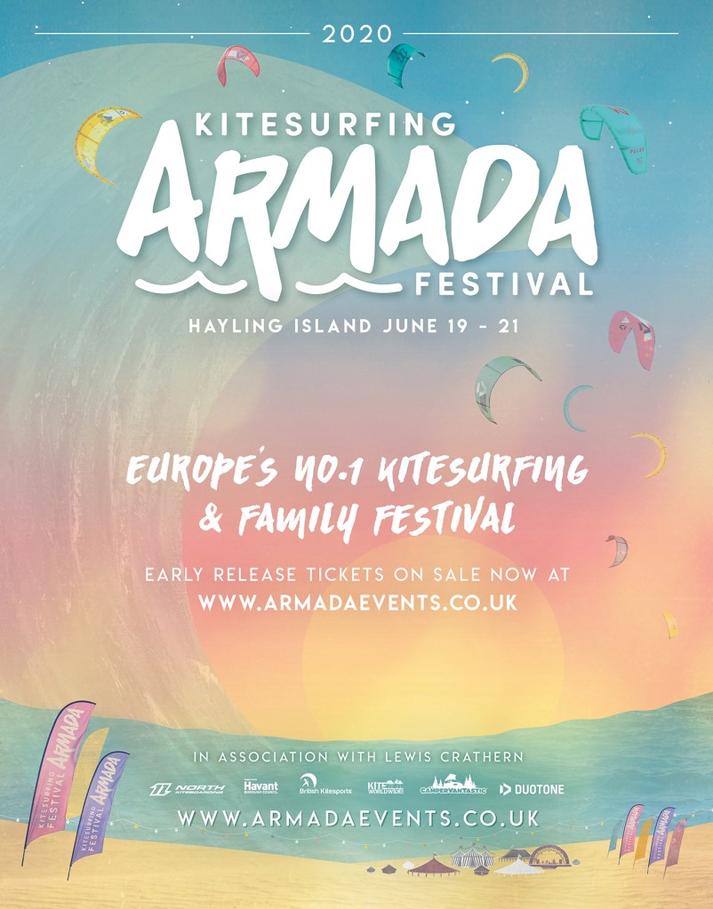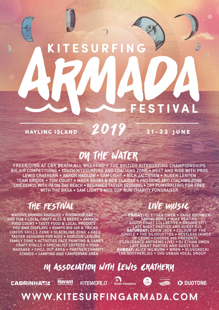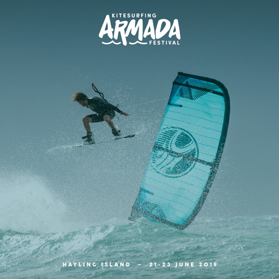

Having had quite a bit of positive feedback for the design in 2019, where I chose to go down the heavily filtered sunset in the sea photography route, this time I wanted a more hand-drawn illustrated style to the aesthetic, that would pay tribute to the airy summery retro vibes of seventies California surfing culture, and the many supremely cool surf posters that emerged from those times. Sadly, along with pretty much every other event worldwide in 2020, due to our lovely friend Rona, Armada had to be postponed. Luckily the festival was able to take place the following year.
Below is the base layer of the poster, designed so that various forms of text can be added over the top for the different uses. I layered photographs with illustration, sun burst photography, and real texture to give a bit of meatiness to the design, using real images of the sea for the sea, sky for the sky and sand for the sand. When it came to the smaller details I wanted to add texture of manmade materials, so the tents and vans were cut out of various different rusty metals. And I wanted to give a bit of dynamism to show the movement of the kites that were flying fiercely and proudly in the air, so I added gentle white sketch lines around each of them. All with a muted palette, but blended with vibrant summer colours this poster gives me such happy summer vibes which is what you want when thinking about a beach festival.
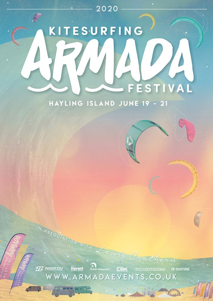
The final poster ended up being a bit more refined with more kites around the logo, and the white sketch lines around the kites and vans on the bottom left removed, which was not my choice, but I’m still happy with how the final poster came out.