Kiteworld Magazine: issue 75

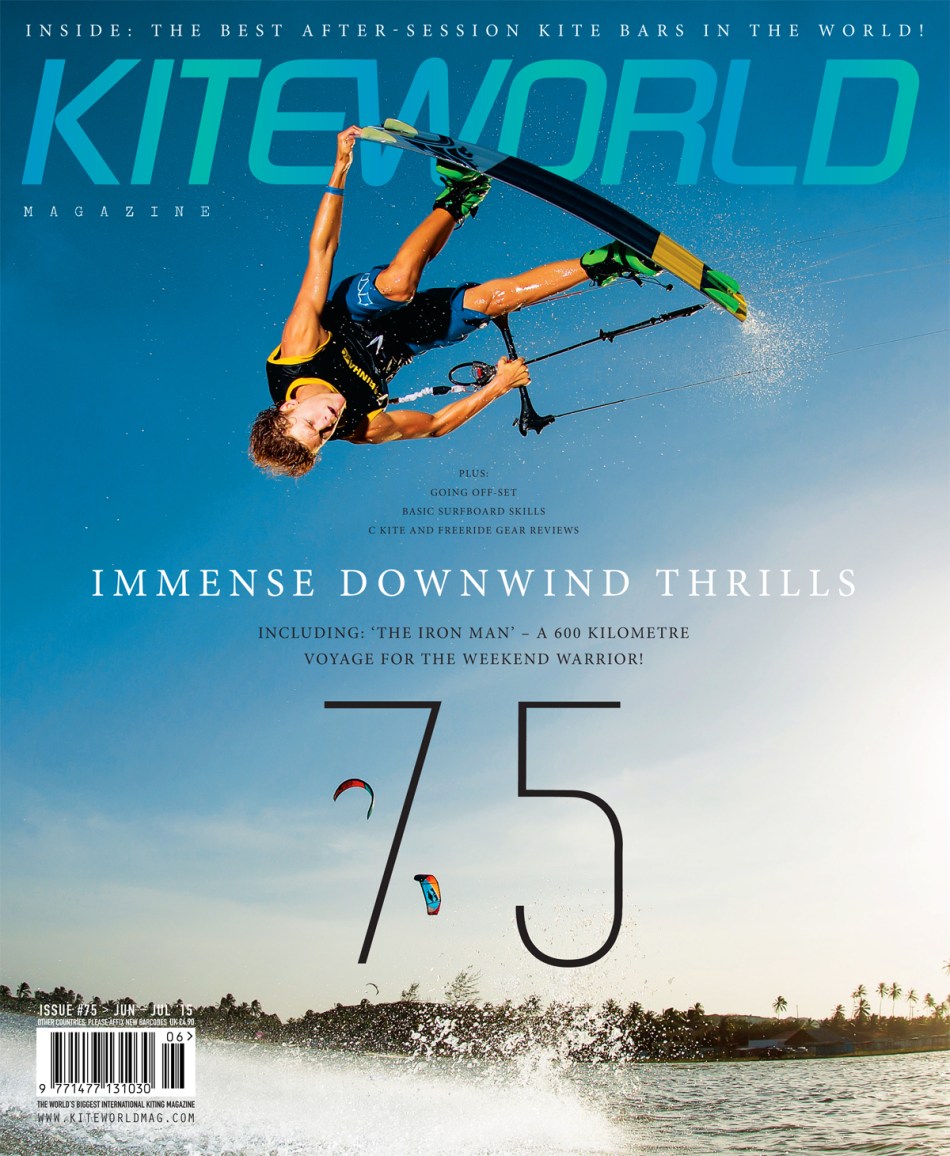
The final cover art before it goes to print for issue 75 of Kiteworld. I had such fun playing around with typography on this one. The shot was quite empty around the rider so I had lots of room to play with which is always nice. I like the fact that it almost looks like I created a stack of words that the rider is gently nestling on, like typographic jenga : )

And what do you make of my two-tone logo? I always like to have a little something different with my work. It doesn’t have to be completely outrageous and sometimes it’s just me that notices it, but that’s fine.

Kiteworld Magazine

Kiteworld Magazine: issue 74

Here is my work for Kiteworld mag, issue 74. I decided to go with a lovely warm, analogue feel on the cover shot, almost a 70s surf vibe. I did this by pulling out the yellow in the curves in Photoshop, as well as the cyan and black a little bit to give it that retro, faded by the sun look.

Using a classic serif typeface also helps to sell this magazine as something that has class and authority with its subject. Kiteworld’s tagline is ‘The Original Kitesurfing Journal’, and it being the biggest selling KS mag in the world the overall look I always want to create for it is clean, high end and timeless.

Kitworld magazine issue 74

KITEWORLD MAGAZINE ISSUE 74 EDITORIAL