BOOK DESIGN: CRAFTY MAKES…

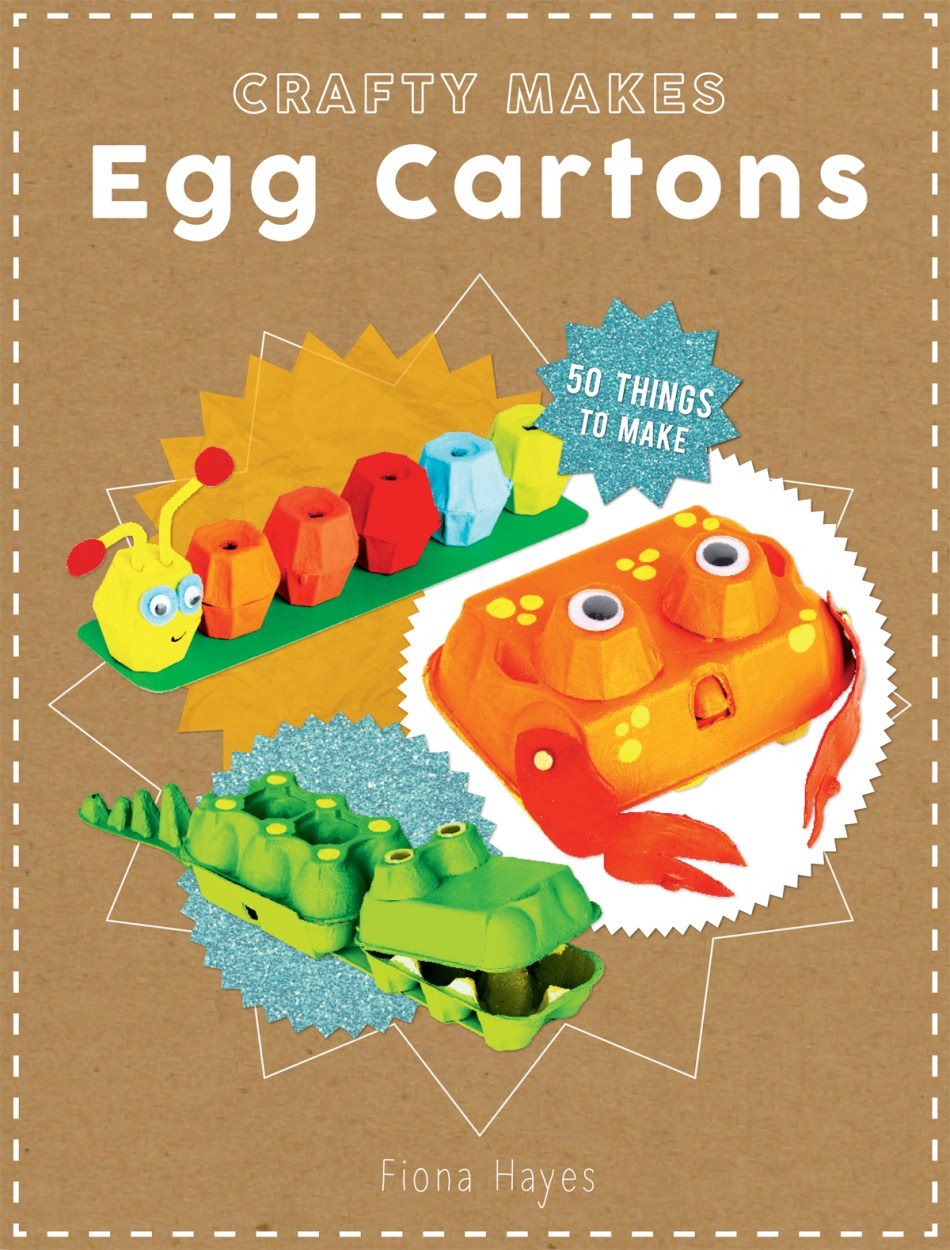
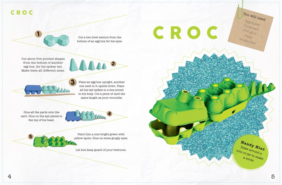
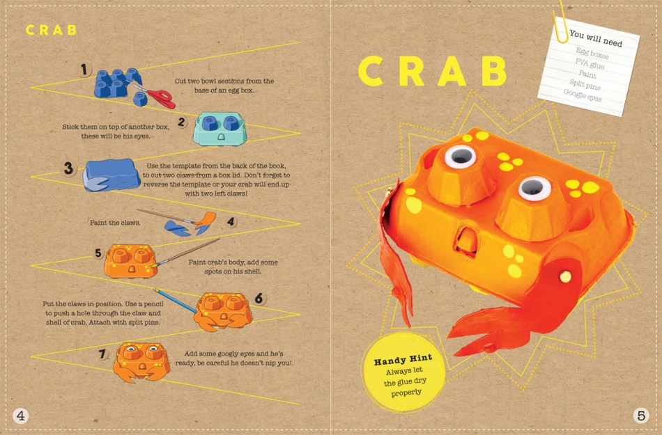
I recently worked on two projects for international book publishers, Quarto, for their Kids Books division, QED, in time for the Frankfurt Book Fair. This particular project was to create the design and identity for QED’s new craft series, Crafty Makes. Although keeping it fun and bright with layering brightly coloured craft papers, with the overall look I decided to go with a clean and fairly modern approach, so as to appeal to young creative mums, and also be simple enough for the children to understand and appreciate. With a healthy dose of Scandinavian design influence, it’s a sort of mix between the style of an Ikea and Mothercare product – basic and slightly industrial, yet inviting and easy to read and use…

CRAFTYMAKES-COVER

CROC

DINO

CRAB

New York Times Cover: Nicki Minaj

How incredible is this cover? So bright. So bold. So eye catching! It reminds me of our first ever cover for Pretty Litter Magazine… Yellow is a very underrated colour in design I think… What are your thoughts about it?

Nicki Minaj Cover New York Times Magazine

Kiteworld Magazine: issue 76

The lovely issue 76 of Kiteworld (and sadly my last) is back from the printers. I had a bit of a task on my hands with this shot as it was so clean. The only conclusion I came to was to have a clean urban design for it, letting the purity of the image speak for itself. The contrast of the solid black logo and the solid white 76 with the beautiful blues and the greens in the water works so well…

You can see most of the covers I’ve produced for Kiteworld here. I was Art Director on Kiteworld during issues 31 to 76! A long and happy design marriage for nearly 8 years : )

Kiteworld Magazine: issue 76

Kiteworld Magazine: issue 75

The final cover art before it goes to print for issue 75 of Kiteworld. I had such fun playing around with typography on this one. The shot was quite empty around the rider so I had lots of room to play with which is always nice. I like the fact that it almost looks like I created a stack of words that the rider is gently nestling on, like typographic jenga : )

And what do you make of my two-tone logo? I always like to have a little something different with my work. It doesn’t have to be completely outrageous and sometimes it’s just me that notices it, but that’s fine.

Kiteworld Magazine

Kiteworld Magazine: issue 74

Here is my work for Kiteworld mag, issue 74. I decided to go with a lovely warm, analogue feel on the cover shot, almost a 70s surf vibe. I did this by pulling out the yellow in the curves in Photoshop, as well as the cyan and black a little bit to give it that retro, faded by the sun look.

Using a classic serif typeface also helps to sell this magazine as something that has class and authority with its subject. Kiteworld’s tagline is ‘The Original Kitesurfing Journal’, and it being the biggest selling KS mag in the world the overall look I always want to create for it is clean, high end and timeless.

Kitworld magazine issue 74

KITEWORLD MAGAZINE ISSUE 74 EDITORIAL