For four months in the lead up to its launch I was hired to direct the design, branding, PR and marketing – be Brand Director – for this exciting new cafe group opening in Brighton. Here is my account of how I went about this project…
THE BRIEF
Overview: To brand and market a new cafe group opening in Brighton that, once successful, will expand to other sites in the city, and then to other cities around the country. The cafe will source and use local ‘real food’ heroes and pioneers within the community as suppliers, and it will have an environmental focus on regeneration and sustainability, as much as possible with everything that it does.
The cafe itself was to be a micro-bakery (baking many, if not all, of its grain related items), a tea and coffee brew house, specialising in serving over twenty different types of loose leaf teas, and its own special single-origin and blended coffees, as well as being an exciting new food place, serving delights from Head Chef and Founder, Mitch, inspired by his travels and training all over the world.
As well as a focus on exceptionally good food, tea and coffee, we needed to engage the cafe’s customer base, and city, as being an important new pivotal business and community-inspired meeting place for the area, understanding the benefits of the where the cafe site was – potentially Brighton’s version of East London’s tech cluster, Silicon Roundabout.
Furthermore the site was to be an important landmark business for advocating and representing what can be done to help regenerate rundown areas. Preston Circus and the whole London Road area (as well we behind Brighton Station) have been undergoing huge, much needed redevelopments over the past few years, and Cafe Plenty – Mitch – was to partake and invest in the driving force of that regeneration and be a great example of how a business can have genuine values, as well as being of significant value to its community and customers, while at the same time being a successful company financially.

A big part of what Mitch is passionate about is extending opportunity to those within his community, as much as possible. This was very much evident in the people he chose to be part of his core team, partners and suppliers on the project, who all have a great connection to the city. For Mitch, it’s very much about keeping things ‘in the family’. In a late night conversation after a few glasses of wine he told me:
“We’re neighbours, and we should all look out for each other at the end of the day. That way you get to help strengthen your community and see each other prosper and grow. That’s what sustainability within a community is, and should be all about.”
It resonated with me, and I felt that it was incredibly important that we communicated this in the overall message of what the cafe and brand was.
This was quite a list. And it was certainly no two-day logo design project…
Although perfectly able to define and articulate the business now, I initially saw this rather large collection of ideas a challenge, as with many new business concepts brought to us by really passionate people, Mitch, seemingly, wanted to do it all. But I could really see what he was wanting, and more importantly, needing to do. Yes there was a lot going on, but I felt very connected to the ethos of his project and was determined to go a great job for him.

THE BRAND ESTABLISHMENT
So, my first job was to simplify the communications of the intentions and values of the business, without losing any of the strength or the integrity of them. And to work out a heirarchy of all of that information. First of all, what’s the information that we need to communicate? And then, who do we communicate that information to? Where does it go? But also, how? In what way? Questions you would ask in any branding project.
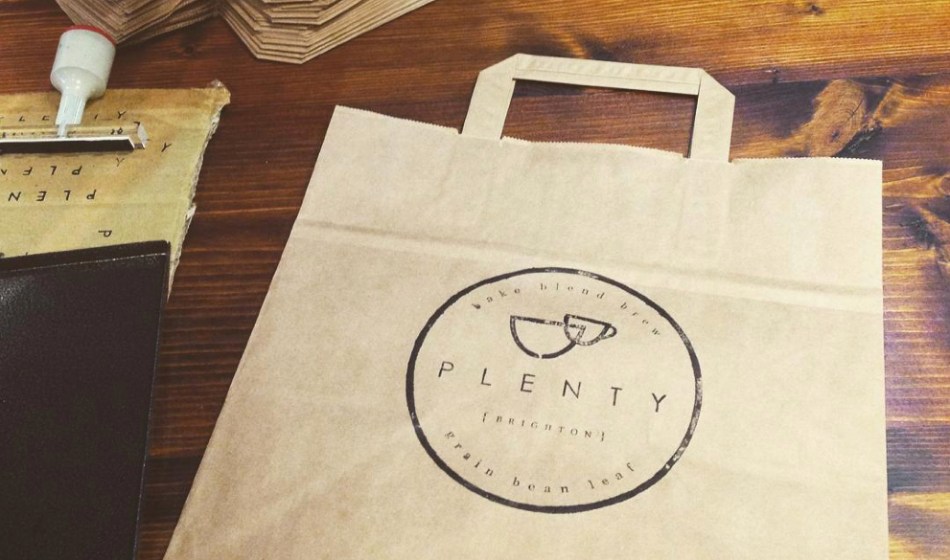
I decided that much of it had to be communicated in word form in our press packs, and in our company literature and interviews, because there was simply too much to say, too much that was actually just really interesting, to warrant bypassing or suppressing it into one short snappy strap line. But I saw it fundamental that we communicate what the cafe actually did within the immediate branding, because otherwise people might not ‘get it’ quickly or easily enough. And what do we do? Well, in short, we bake, we blend and we brew – that’s what we specialise in, and so that’s the first thing we needed to communicate to our customers and audience. The strap line was born:
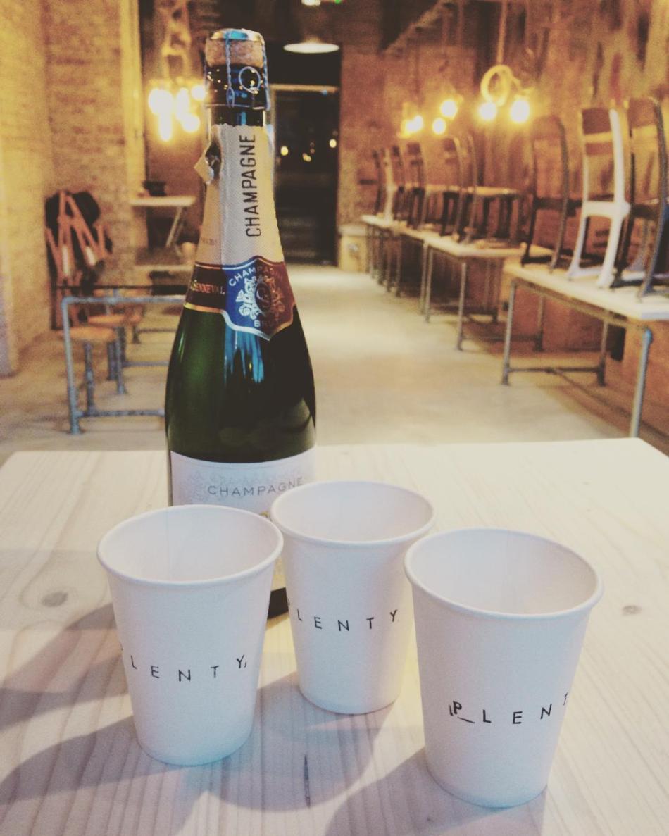
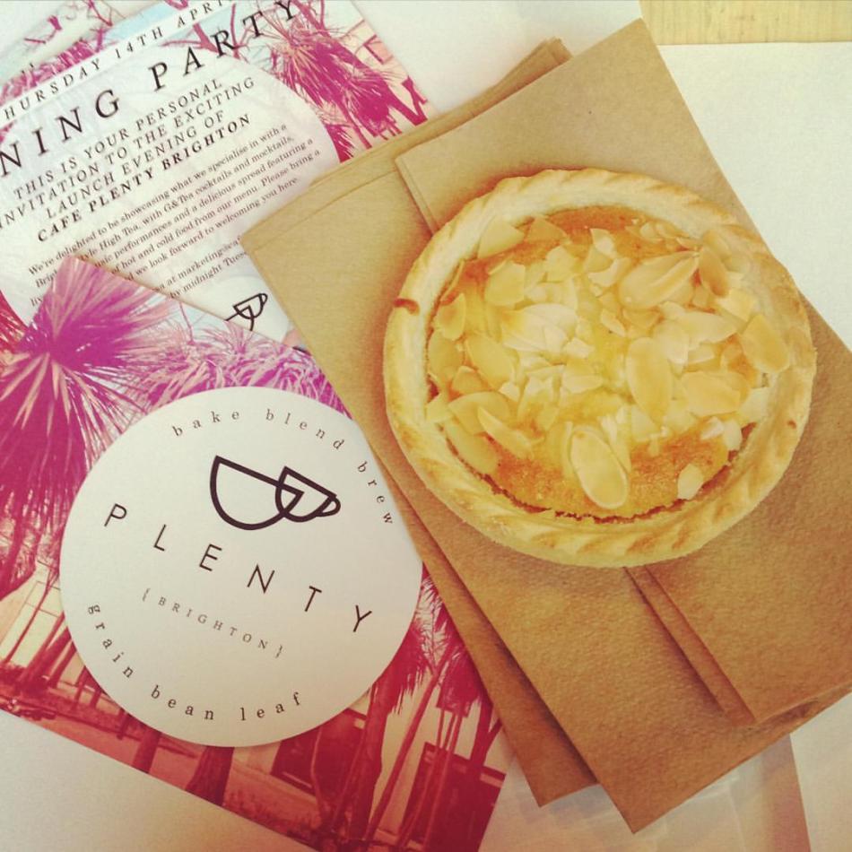
Bake, Blend, Brew | Grain, Bean, Leaf
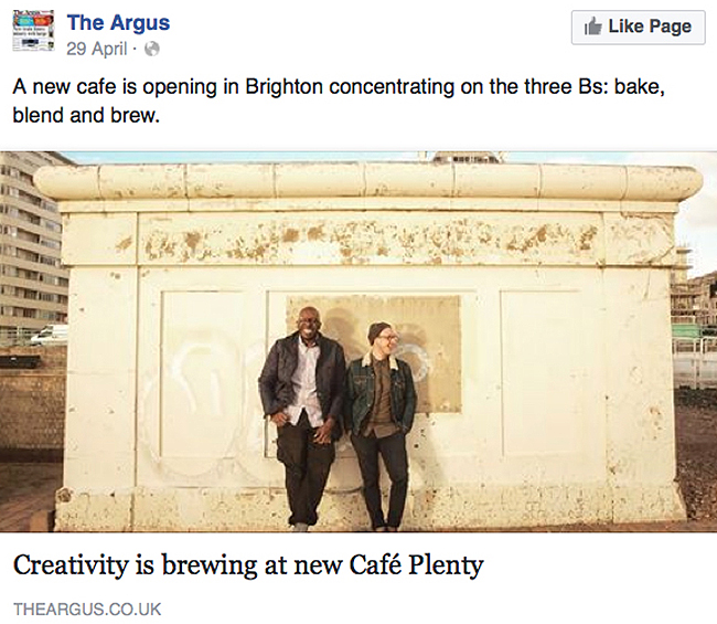
There’s something so completely satisfying about communicating a fair bit of information in a really simple way. It intrigues and it excites. And you really couldn’t get much more straightforward than Bake, Blend Brew… However, I actually saw an opportunity to simplify the strap line further, into a brand phrase, by referring to it as The Three Bs, in the brand literature and press packs, with the idea being that it would hopefully rub off on people outside of the team. Not original by any means, but very catchy and it does do the job. After all, I was branding a business that needed to work as a singular site, that would also have the room and foresight to grow into a multinational name. So why not start as you mean to go on? And it worked beautifully, with Brighton’s most known (and I believe currently longest standing) newspaper, The Argus, using ‘The Three Bs’ in their opening line in an article about the cafe, that went out to over 23,000 of their Facebook followers, and to many more online on their website (the article can be seen here):

THE VISUAL IDENTITY
The logo was inspired by the building that Cafe Plenty Brighton is set within – an original 1960s low-rise commercial block by Preston Circus on Circus Parade, that gently nestles next to the impressively looming tower block, Vantage Point. Both are original 60s architecture and subsequently both are now owned by the same firm. So I wanted to give a good nod to that era and to retain some the building’s heritage, whilst offering a contemporary and timeless aesthetic that would sit well in any modern city or town. It’s not overly corporate but it is firm in its convictions and does allow for the expansion and movement of a business, that born in one place will happily grow to others, should that be the case. The logo was noted as being ‘Classy, but friendly.’ by one cafe supporter on Facebook. Exactly the response we would hope for seeing as one of the main Brand Values of the company is Approachable and Inclusive. So the overall branding should be a really nice example of contemporary design within original context. Hopefully a good example of sustainability right there, too. As a redevelopment project of an urban building and area I felt we needed to show how you can bring the old and the new together.
The style and branding of the cafe space itself is inner-city reality with the ‘rusticness’ of the seaside. It would have been really easy to create high-end and contemporary interior design without much thought – but I wanted Plenty to have an honest connection with its immediate area outside too (inner-city urban decay, mixed with an exciting and vastly growing tech cluster), and to utilise and remind people of where they actually are – one of the nicest seaside towns in the country.
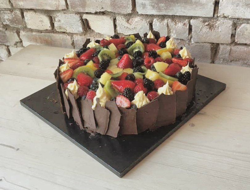
Within the cafe there are notable references to the sea, with thick rope fishing knot lights – and there’s a giant rust-look mural. This sits perfectly against and atop the unfinished-look brick walls and concrete flooring. The colour palette of the logo set is also inspired by the beach, with those rich unmissable Brighton sea greens and pebble golds. But they also point to what the cafe actually does too, and looking at raw coffee beans, they have a lovely green gold hue – very different to roasted beans that are dark. So all very natural, raw and fresh colours. Which was also significant to how I wanted to represent the food that would be served too; fresh, healthy, rich and exciting in flavour and body. Ultimately that’s what we were physically selling – the food.

MY WORK APPROACH
I worked incredibly closely with Mitch – and with and Dan, the manager of the cafe. Ensuring we all agreed on and thoroughly understood decisions made at virtually every stage of the project. That’s one of the main advantages I would say is of working with just one creative – a luxury I just don’t believe you would get from a busy design agency. Certainly not one that involves random late night Facebook Messenger discussions or three hour long meetings three times a week. I was there to answer questions, brainstorm ideas, discuss issues and just ‘be there’ most hours of the day, and most days of the week too. Of course Mitch paid me well for that to be the case, but he needed that flexibility from me as he was focused on other pressing matters, such as project managing the entire site demolition and re-build. As well as managing his other business in London.

I am at a stage in my career where I have a few really strong projects in my portfolio, my own arts and lifestyle publication, for one, which is what drew Mitch to me in the first place. So the trust was there that I would deliver from the offset. I had a huge amount of freedom to run things my end, how I saw fit, which is always a great thing to have. And it was Mitch’s boundless passion and drive for his project that drew me to want to work for him. It’s lovely to work with people that are as excited about what they do as you are, as you can really connect on what matters. Another advantage for my clients, I feel, is that with Brighton being my home town, I am seriously invested in making good things work for the city. I care about what happens here. And I genuinely want to see people realise their dreams. So anything I can do to help that is great.
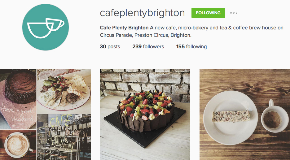
All in all, projects for Plenty included fine-tuning the company ethos, establishing the brand values, and writing the brand literature. Creating the visual and written language and identity, with logo sets, strap lines and the brand book (that includes over 60 different logo varieties). I created and managed the social media sites, I art directed and shot photo shoots, designed items for the cafe space, created press books breaking down and detailing the entire story of the cafe space and brand. I managed and edited interviews, liaised with and gave interviews to press, and I oversaw the PR, marketing and launch campaign.
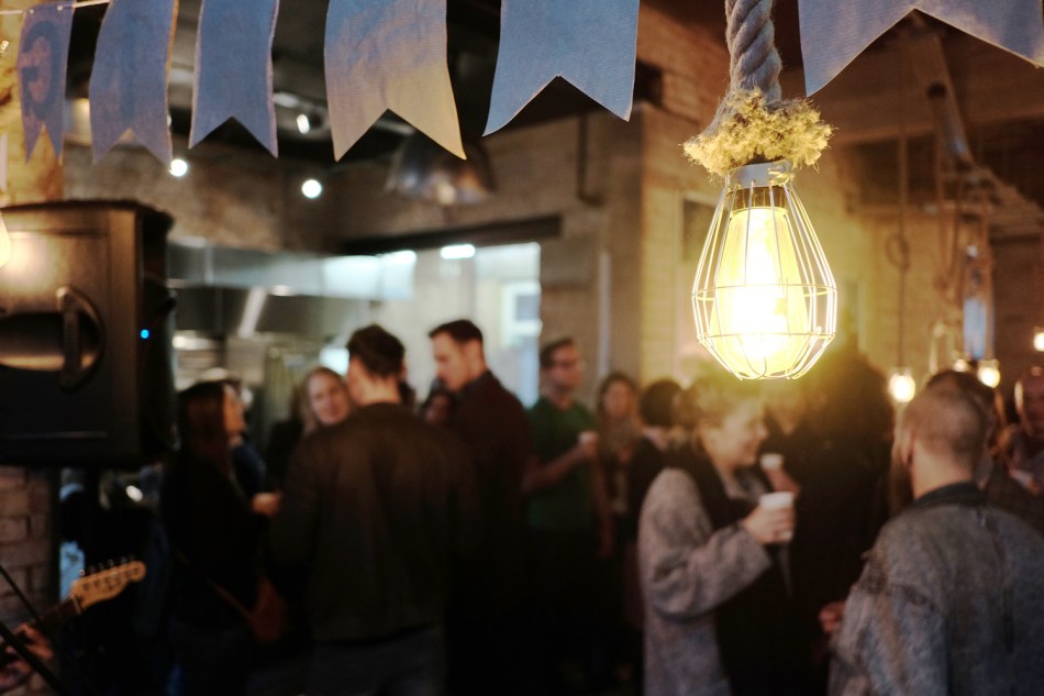
Towards the end of the launch phase I created other PR strategies and materials, including overseeing and managing the launch party, its PR and overall design and theme (which was a Brighton-style High Tea, with G&Tea and coffee infused cocktails – focusing on showcasing what the brand and cafe was all about). The launch party was a great success, leading to many of the well-known Brighton and Sussex and South newspapers, magazines and food and restaurant bloggers giving extremely positive reviews and introduction pieces on the cafe (such as The Argus newspaper, BN1 magazine, and Etc magazine, who printed a full page on the launch party in their May issue). All unpaid for coverage, which is really important to note, as I know from ‘being’ a magazine, this rarely happens without some kind of monetary deal.

The success of the launch was so much so that after just two months of opening, large, well-established businesses and investors in Brighton and London wanted to form brand or business partnerships with, or to invest in, Plenty. There is a very well-known food and retail business partnering with the brand right now in fact, with a second cafe site opening any minute. I’ll link that story here once it’s ready to be released.
IN SUMMARY
The plan was never to just create a nice looking identity for a small cafe, but to create a brand that would speak to the surrounding residents and customers and successfully communicate the right things to the right markets – decision-making people – that would allow the business to grow into a nationwide cafe group. Something much larger than your average cafe, and a plan that Mitch has had from the off-set. Hopefully I’ve given Cafe Plenty an identity for this to be the case, that will also allow the brand to retain its core values of being ambassadors of using local and ‘real food’ heroes as suppliers, and of regeneration of rundown areas.
Although much of my work is complete I will continue to offer the company design, brand and marketing support where it is needed. It has been a fantastic project and journey to have been involved in, from conception right through to launch, and a wonderful thing to witness growing and be supported by so many. Because we really do need more businesses in Brighton (and everywhere) that represent and ‘do’ more than what they are providing for us on just the surface. That actually commit to contributing to make a better world, no matter how small or local that commitment is. And with forward-thinking genuinely community-loving people like Mitch, that really care about the city and its future and the impact that their business will have on the environment and neighbours, it’s easy to want to support their journey, and be part of it too.
Cafe Plenty Brighton, 3-4 Circus Parade, Preston Circus, Brighton.
www.instagram.com/cafeplentybrighton
www.facebook.com/cafeplentybrighton
twitter.com/PlentyBrighton